


Hi lovelies!
Personally I find that one of the most clashing colour combos is purple and green. I was curious to see if I could do a non-Halloween-y, non-ugly manicure using these two colours and... Eureka! I found the magic trick to combining purple and green! It's a blue buffer zone. A blue buffer zone saved the day!


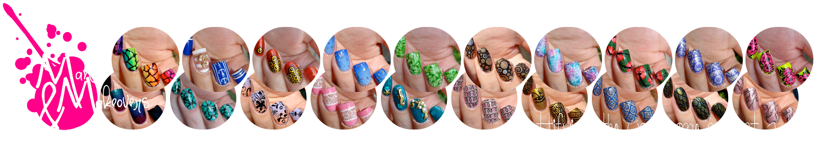
So I started with a white base (Essie "White Page") and then I created a gradient with purple (Essence "Lilac Is My Style", Essie "Too Taboo"), blue (Essie "I'm Addicted") and green (Vogue "Neon Limón") and a sponge. I then added a layer of holo sparkle with Glam Glaze's spectraflair top coat and stamped with BPS black stamping polish and BP-L029. I sealed it all in with some Seche Vite. Oh uhm yeah, all pics were taken with flash, because of course The Sun had left us for a couple of days...


What do you think?
And don't forget to check the manis of the other ladies below!

This would make a great pattern for clothing! Gorgeous gradient!
ReplyDeleteAh, the gradation colors, that topper and the flowers! All so perfect!!
ReplyDeleteBeautiful colors <3
ReplyDeleteThat is beautiful
ReplyDeleteThese are all some really contrasting colours, but at the same time they seem to work well in this nail art design? I don't know how you do it D:
ReplyDelete